In 2021, Weigel’s began working with University of Tennessee (UT) athletes, and that has become “the most exciting part of our branding strategy,” said Nick Triantafellou, director of marketing and merchandising for the Powell, Tennessee-based company.
“We’re not just a gas station,” he said. “We’re part of the starting lineup now. We are more than tradition and milk; now we are humor, fandom and sports.”
Creating a strong brand for a convenience store is essential to creating loyal customers, building brand recognition and keeping sales up. According to a 2024 NielsenIQ study, 30% of company revenue is generated on the strength of a brand.
Weigel’s agreement with the UT athletes is a name, image and likeness (NIL) agreement. This has gone a long way toward boosting Weigel’s engagement with its customers, Triantafellou said.
The c-store company began working with baseball players when Weigel’s noticed its social media posts about player performance and other details were getting thousands of likes. “We saw the opportunity—this is what they’re passionate about, so let’s meet there,” he said. “We realized everyone who’s our customer is a humongous University of Tennessee fan.”
Weigel’s has also done special promotions, such as offering customers a free 24-ounce Coca-Cola every time one of its sponsored athletes hit a home run or struck out six batters. The company gave away 97,000 free drinks last year.
“The cost of the drinks is nothing compared to what we gained. The engagement, the brand lift and the growth in our loyalty program made the ROI on those promotions undeniable,” said Triantafellou. “NIL has created brand fans for life: customers who won’t shop anywhere else because they feel seen by what we do on social and how we reward them through our loyalty program. These promotions build more than transactions—they build pride and belonging in the communities we serve.”
Weigel’s has also caught the attention of sports commentators, who talk about the partnership during games.
“The loyalty and fandom we’ve achieved is amazing,” said Triantafellou. “People view us as part of sports. We’re still a gas station, and we now belong in this [other] space.”
The branding has taken on a life of its own. Since it began, Weigel’s has created 12 commercials featuring the UT athletes, with “many more” in the pipeline, replacing its commercials about what consumers can buy at the convenience stores. Said Triantafellou: “We have changed ourselves in the eyes of the consumer.”

Weigel’s has expanded its athlete partnerships beyond just one sport—now including teams such as volleyball and soccer—and has started working with athletes from regional universities as well. “With over 60 athletes signed, we believe every one of them represents the heartbeat of the communities we serve,” Triantafellou said.
Cenex has also used sporting events to boost its branding. The company partners with the Northern Rodeo Association and previously partnered with the National Intercollegiate Rodeo Association. It also partners with 12 colleges and universities throughout the Midwest within the Cenex footprint, such as the University of Wisconsin and the University of Iowa, and professional sports teams such as the Green Bay Packers.

“It creates great brand recognition,” said Kim Bobzien, expert marketing specialist for Cenex parent company CHS, Inver Grove Heights, Minnesota. “We love our sports sponsorships.”
Cenex’s branding is slightly different for each group it works with. Some campaigns feature in-stadium branding (such as on the scoreboard, the wraparound board, the concessions area or the TV screens); some include radio or TV commercials; and some are digital, such as banner ads on the partner’s website. Cenex might sponsor a sweepstakes and provide the prize for it, or it might run a contest on social media featuring Cenex’s logo.
The rodeo associations are important to Cenex customers because many are farmers with family members involved in the rodeo, said Matt Mohs, vice president, Go To Market, CHS. “It’s important to keep that branding in front of people’s eyes,” he said.
For the Northern Rodeo Association partnership, Cenex creates cobranded social media posts and tags Cenex. For the Green Bay Packers, there are ongoing social media campaigns. “It’s a great opportunity to get the logo out there and be really ingrained in these partnerships with teams people love,” Bobzien said.
Dig Into the Details—and Have Fun
Branding is central to the design of Wally’s convenience stores.
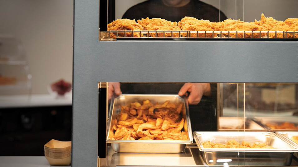
This Fenton, Missouri-based company’s stores are full of Wally’s-branded merchandise, from playing cards to bumper stickers, and the stores are unlike any other. They’re designed to be fun with a road trip vibe, appealing especially to people traveling through the area. Each features a 1970s Winnebago that’s open on one side and displays merchandise on interior shelving. The stores also feature a diorama of taxidermied animals using and wearing Wally’s merchandise and clothing.

“The branding is part of the experience,” said Andy Strom, chief experience officer. “We’re trying to create something that not only elicits an experience, nostalgia, timelessness and fun but that’s also extremely memorable.”
People want to come back and discover something new, he said, and they often buy branded items as gifts. “Then the branding travels across the country,” Strom said. “We design our merchandise to be fun, bold and giftable so people buy it for themselves, but they can’t wait to give it to someone else. It’s a walking billboard. We’re turning everyday items into brand ambassadors.”
InConvenience Inc, Chicago, is remodeling several stores previously owned by SQRL Service Stations and rebranding them as The Gas Spot convenience stores. Twelve are open so far. There are four in Missouri, with another coming by year-end; of the five in Arkansas, one is open, with the rest to follow later this year. The company also has stores in Iowa that it will remodel or open by the end of the year.

The company is taking the rebranding very seriously while having fun at the same time, said brand manager Alicia LaFollette. To build the new brand, InConvenience executives asked themselves what they want the company to be known for and how they could carry that experience through all of the stores.
LaFollette spent her first weeks with the company diving into market research and exploring details about the stores’ audience. She discovered that 52% of the audience is female and came up with the key terms of warm, inviting, friendly, clean and safe. Those words guided the team to the colors they chose and how they selected interior signage, including fun bathroom and beer cave signage.
The colors, said LaFollette, “make a huge difference.” There’s a darker dusty blue, a lighter blue, a mustardy gold and a cream color as an accent, and every location has a two-tone wall with a chair rail. Including blues and having more than white walls means that Gas Spot locations “lean toward that boutique market,” she said.
The company wanted the stores to feel different. “We had a goal of making it a place you want to spend some time in,” said LaFollette. Areas with chairs meant for customers who’d like to stay awhile are called Gathering Spots—or, more familiarly, G Spots. “We want people to have fun with it,” she said.
“Everyone I initially pitched this [G-Spot branding] to said, ‘You’re crazy—you’ll offend people,’ and that is not my intent,” said CEO Tiffany Fraley. “We need to stop taking ourselves so seriously, and then it becomes fun. As our branding strategy grows and we put more and more into it, we have more opportunity, and there’s nothing out there like this.”
Other parts of the stores are also branded. Packaged beverages and the coolers are always The Gulp Spot; coffee and soda is Refresh and Refuel (featuring a gas pump logo pouring liquid into a coffee mug); private label general merchandise is in The Gear Spot. “We try to use a letter G wherever we can,” LaFollette said.
Gas Spot also recently introduced Clutch the Clam as its brand mascot. A lot of thought went into Clutch’s creation and the strategy behind it.
Clams, says Fraley, “are nature’s unsung heroes. They keep their ecosystems clean, they stabilize their environments and they thrive by doing the little things right.” This was all part of the backstory InConvenience has created to make its brand strong. Clams are usually the first to let us know when things go wrong, she said, “which is a reminder to us to pay attention, adapt and protect what matters.” Clutch’s name is a reminder to people not to clutch their pearls.
‘Don’t Try to Be Everything to Everyone’
The most important thing to look at when analyzing your brand is to determine what makes it unique, said Ernie Harker, president of ErnBurn, a brand development consultancy in Salt Lake City, and former head of marketing for Maverik.
The second thing to think about is who your customer is and why they would care about your brand—and be very specific. Customers want a brand, Harker said, that’s “highly attractive” to them. But if you put the customer’s identity before the store’s identity, he said, “you lose yourself—[then] you don’t have the energy to maintain the brand, and it doesn’t come across as authentic.”
For Maverik, for example, he said, it’s all about adventure elevating life, and that vein runs through everything. For Stinker Stores, all branding revolves around its mascot, Polecat Pete, which “helps people remember what’s unique about them,” said Harker.
“They have a little moxie. Getting away from that … would have taken the difference and the attractiveness out of that company,” Harker said. “When you create a personality that is super highly targeted, you’ll actually get more loyal customers.”
Harker likes to start with some questions when creating a brand: What makes you unique? What do your customers want? What are your six brand adjectives? Exciting, safe, clean, fun? Harker has a rule that two of these must be adjectives that can’t be used to describe any other c-store company, and those are the hardest to come up with.
Once you’ve determined your brand, “you have to make sure it’s in everything you do,” he said. It even helps you hire the right people: those who care about what you care about. It makes sure your message is internal as well as external. “You have to drink the Kool-Aid too.”
Be Transparent About In-Store Changes
Harker is also a big fan of rebranding or refreshing “so your customers know you’re alive—that someone is breathing behind the steering wheel.” C-stores should do a brand refresh every 15 years or so, he said.
A small refresh can emphasize what you stand for, and it’s important to change for more than change’s sake. If you’re environmentally friendly but have a red and black logo, it’s not inherent, so a simple color change to greens, yellows, or blues could communicate a lot to customers. That color change can ripple through everything in the store. “Brand colors, fonts and tone are all based on a specific strategy to elicit a reaction from your customers,” Harker said. “If you know what it is, you can architect a visual and an experience that will elicit that reaction.”
To make sure there’s an easy or seamless transition, c-stores should be thorough in showing employees first how and why they’ve made the changes, maybe through a video or written materials, Harker pointed out.
It’s important to make a big deal about this, he continued. Launch it, create new marketing materials and heavily invest for the first three to six months to explain what the difference is from the old brand to the new one. “Make sure you draw a connection,” he said. “If there’s a vacuum of information, customers will come up with their own reasons for the change. Promote the messaging in your marketing and advertising so you bring them along with you.”
Rebranding is a good idea “when there becomes a disconnection from a chain’s original strategy to what the current brand stands for,” said Tim Girvin, founder and chief creative officer of Girvin, a strategic branding and design company in Seattle. “This could wrap around market trends, experience expectations, the c-store is changing, the footprint for offerings is widening, and what people want, or expect, has shifted.”
To get started with a rebrand, he suggested first conducting an audit to create “renewed clarity about positioning, values and personality—where the brand was, where it is and goals for future representation.” This strategic reckoning, Girvin said, will help the brand “get to the next level of experiential expression and customer relationship strategies.”
Once you’ve done this, “there should be a recognizable brand style that flows through every touchpoint for guests’ journeys in the c-store experience strategy,” he said. Stores should build a style and a disciplined, no-nonsense brand guide and stick with its principles. The most important things to remember, he added, are consistency and cohesion. “If the experiences and brand contacts are consistent, they cohere in the mind of the experiencer.”
Girvin recommends convenience companies ask themselves: What’s their story? Who’s telling it? What does it sound and feel like? Who’s it for—and, crucially, who cares? “Any good brand has a story, and it’s important to reflect on how this story would be told. And what is its voice and origination? Feeling counts for everything and is the vibe of the brand, so people say ‘I know this place, I fit in here, it’s made for me.’”
In your rebranding strategy, think big and think small, Girvin suggested. Make a big statement with some kind of spectacle, but “it’s often the small touches that people remember,” he said. “Big opening statements have their own memorable character, but the interior arrays of experience contact are where the sales are.”